HOLY WEEK
podcast experience
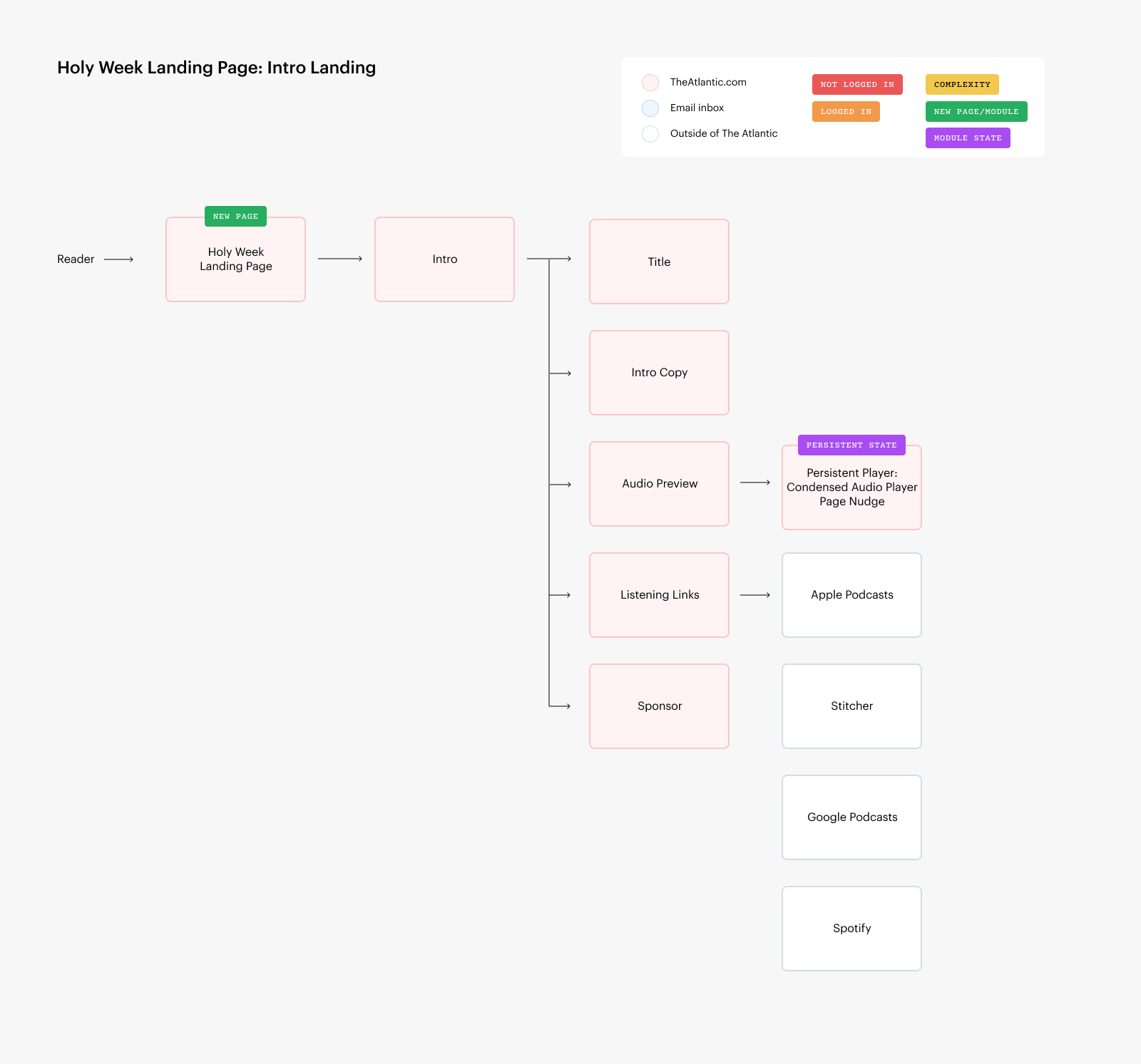
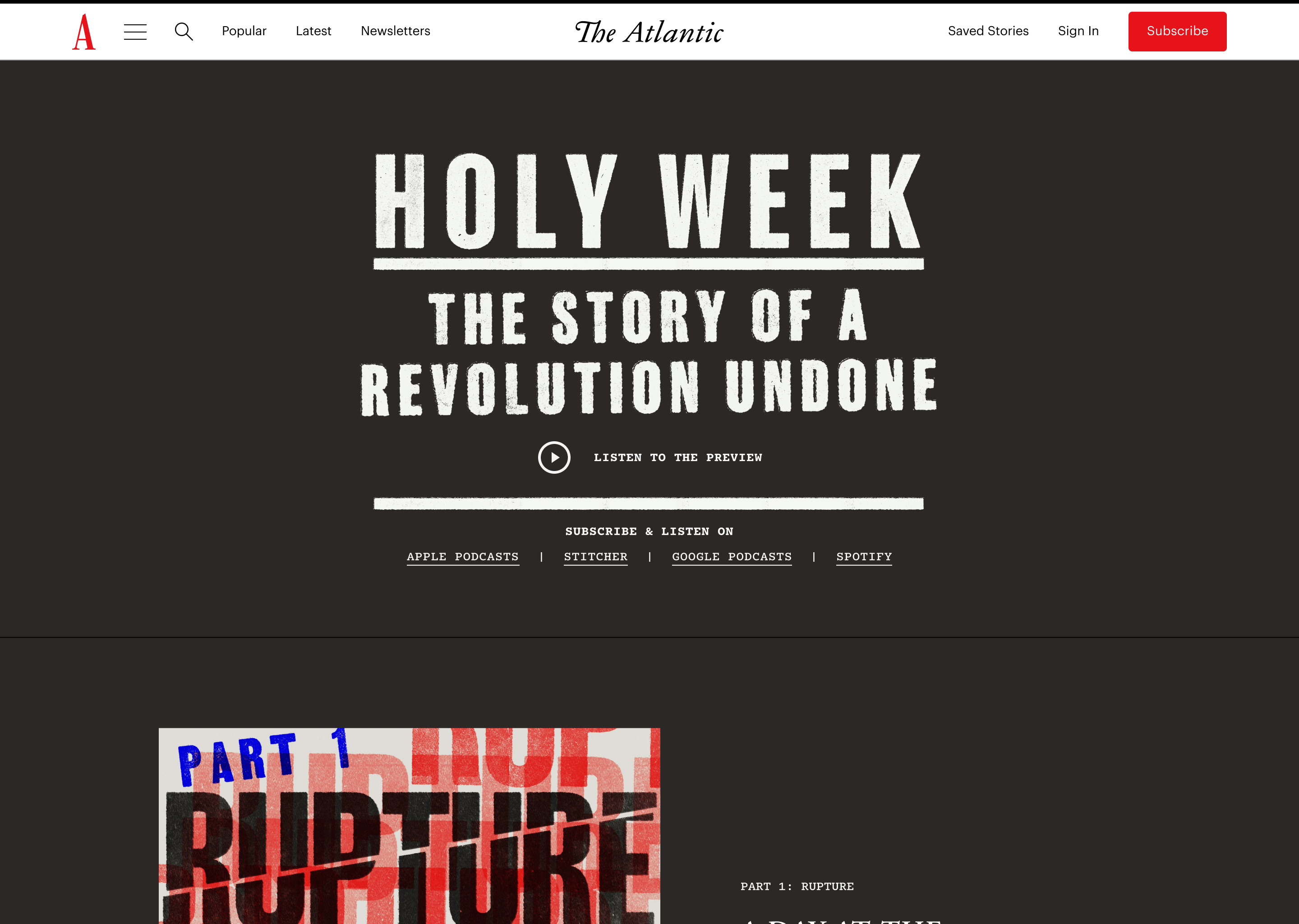
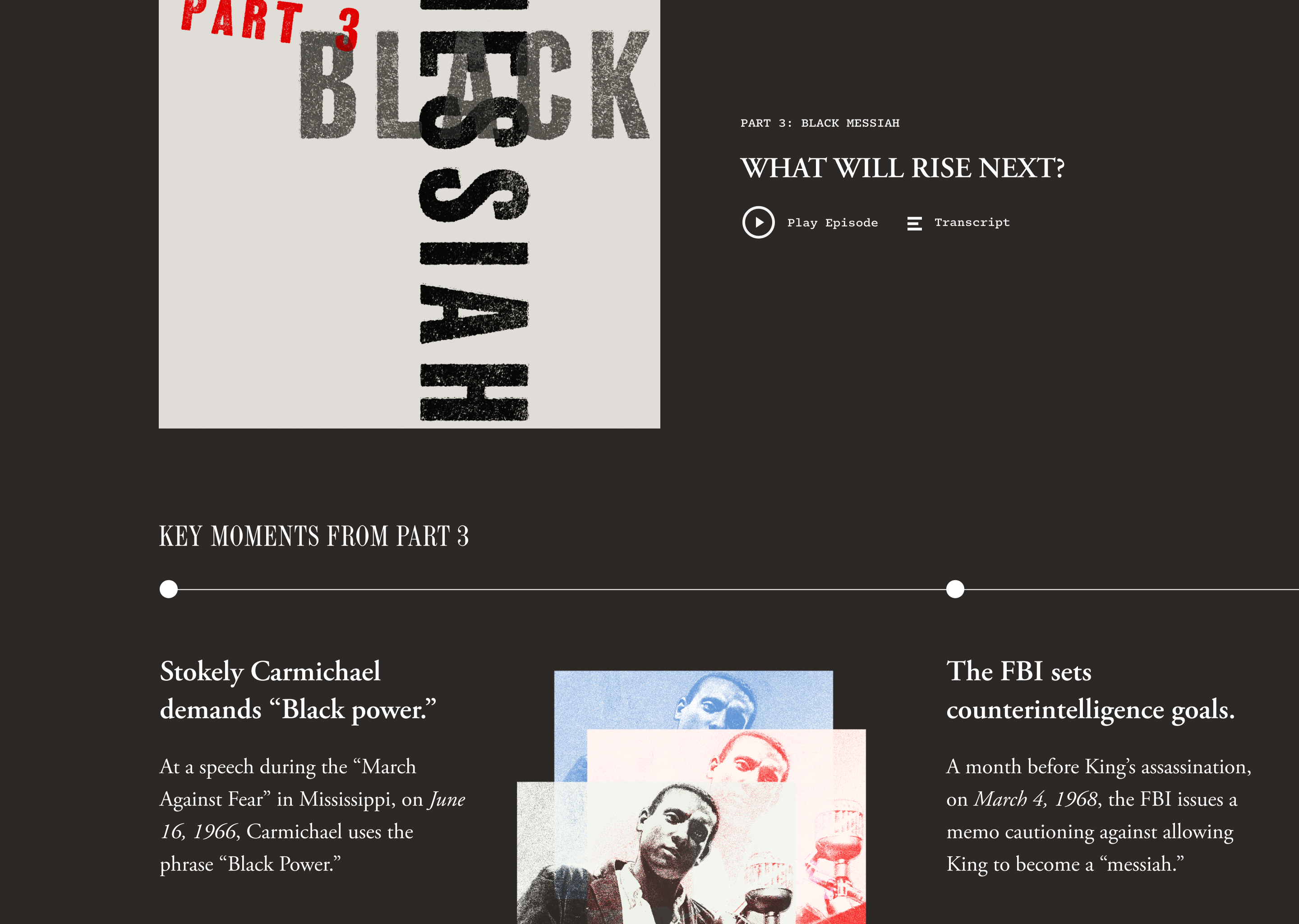
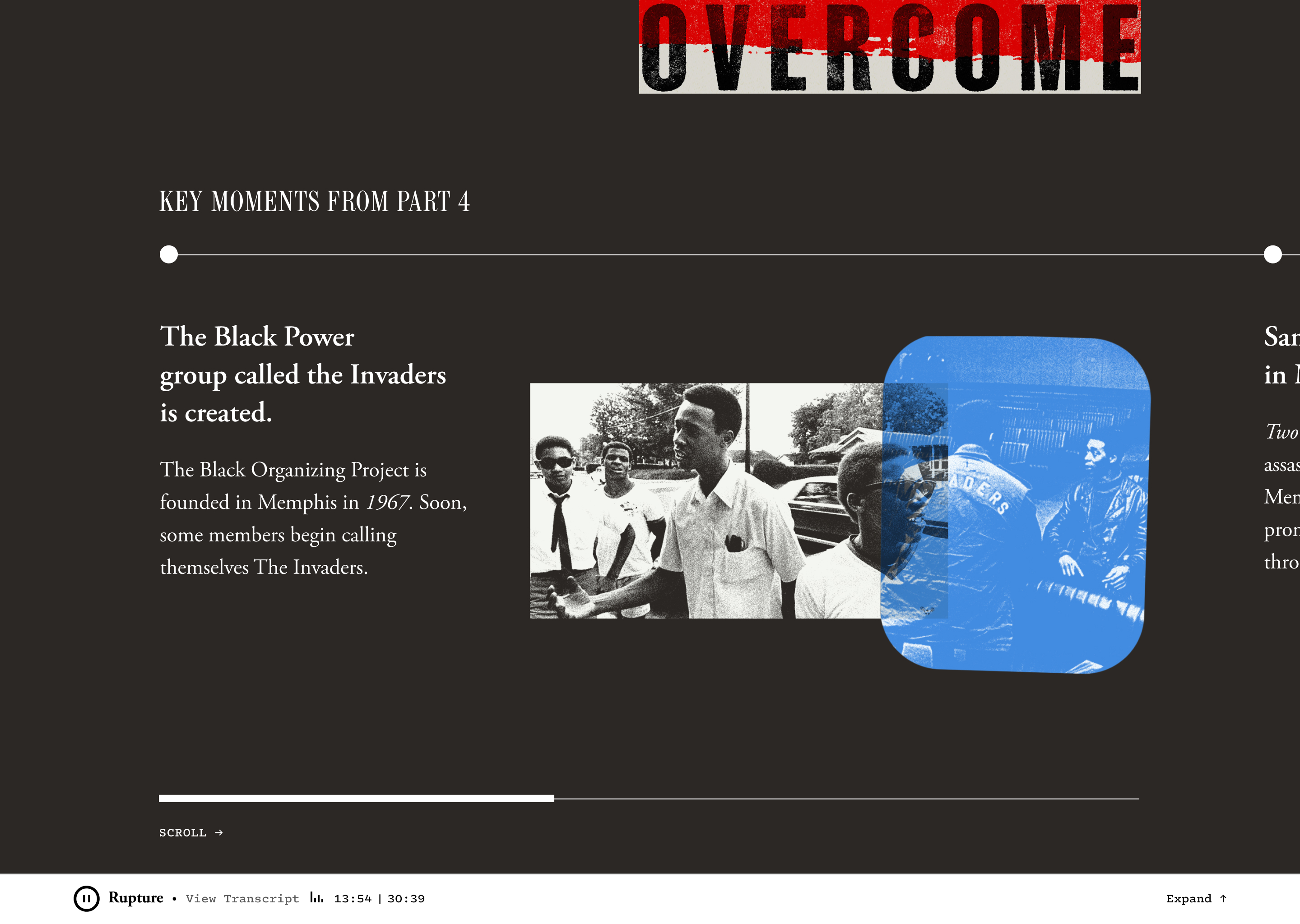
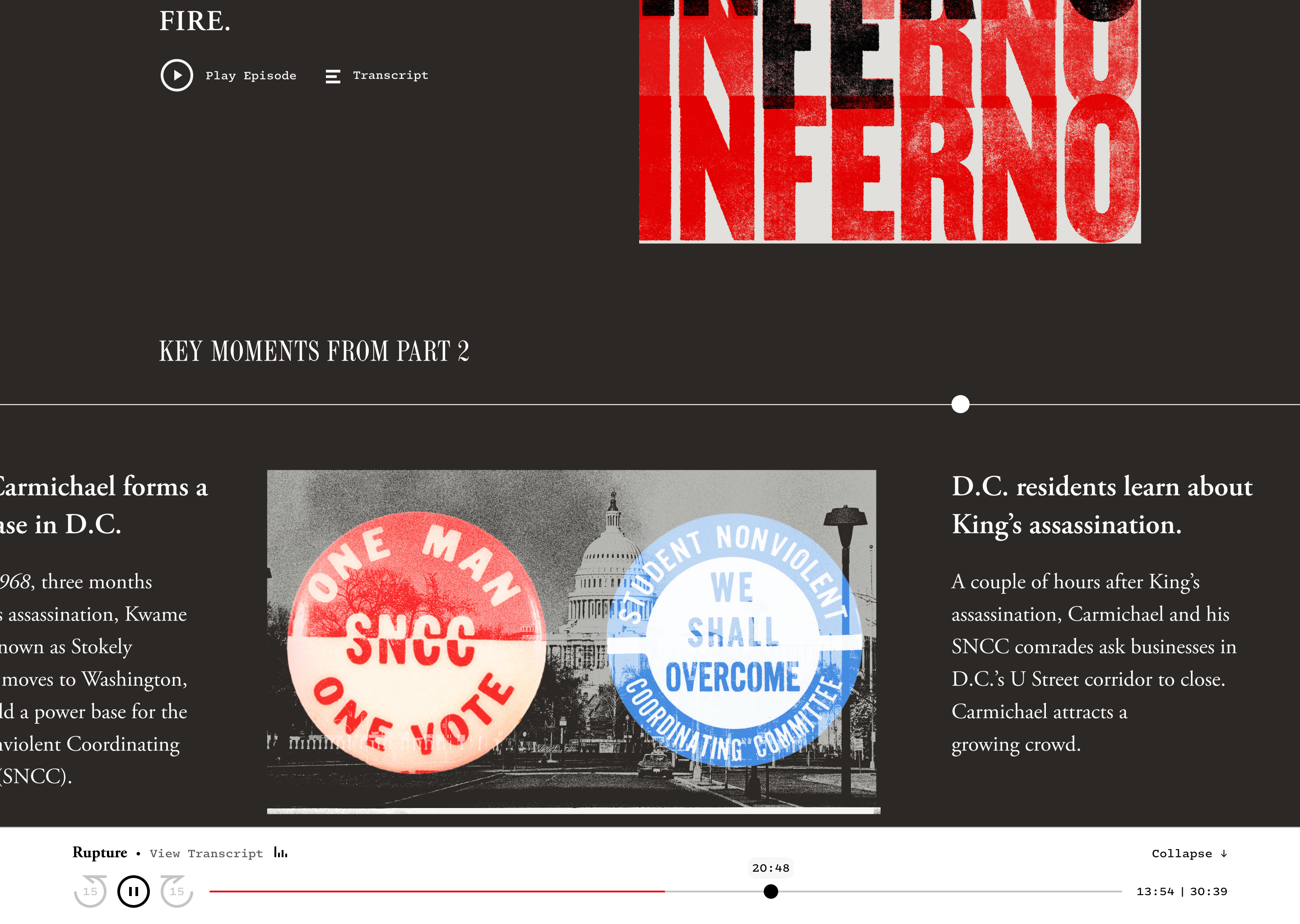
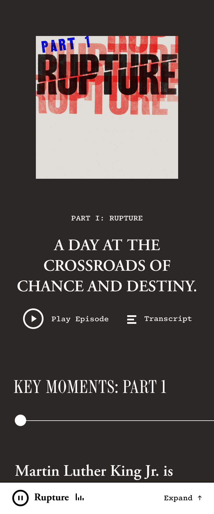
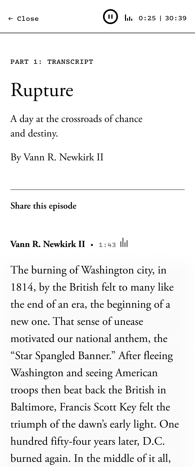
This project is an immersive eight-episode limited podcast series for The Atlantic hosted by Vann R. Newkirk II that explores the events of Holy Week: The Story of a Revolution Undone. In collaboration with the product and audio editorial teams, we thought about audio accessibility, visibility on the main site, and how to highlight key moments of the story. This podcast page is designed and built to have a consistent audio player so that readers can explore the page and key moments as they listen, or even listen while their browser is closed. The transcript experience is interactive and allows readers to scrub through the podcast episode by clicking their desired text.
Role: Lead Product Designer
Team: Vann R. Newkirk II (Senior Editor), Christopher J. Chester (Senior Product Designer), Paul Spella (Art Direction), Dylan Momplaisir (Software Engineer), Dante Meick (Software Engineer), Karen Bowers (Product Manager).
Live Site: The Atlantic
Role: Lead Product Designer
Team: Vann R. Newkirk II (Senior Editor), Christopher J. Chester (Senior Product Designer), Paul Spella (Art Direction), Dylan Momplaisir (Software Engineer), Dante Meick (Software Engineer), Karen Bowers (Product Manager).
Live Site: The Atlantic


NEWSLETTERS AT THE ATLANTIC
product and brand design
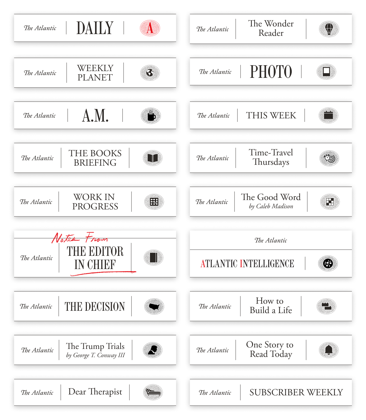
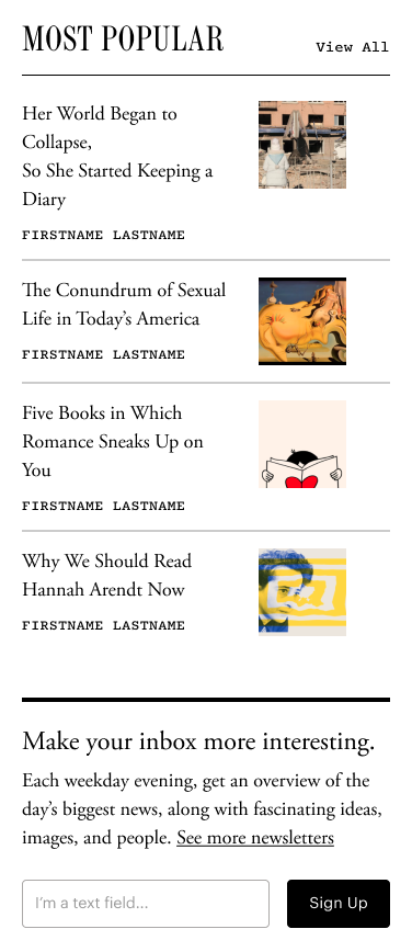
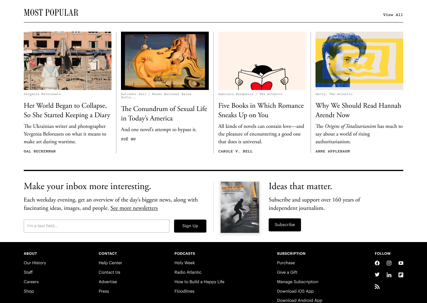
The newsletter ecosystem at The Atlantic engages our readers by circulating stories and alerting readers when an author has published. Each newsletter has individual branding that fits in with the broader brand system, maintaining consistency and familiarity for readers. Our newsletters currently explore climate, relationships, technology, books, photos, our archive, and we are slated to expand to more topics soon.
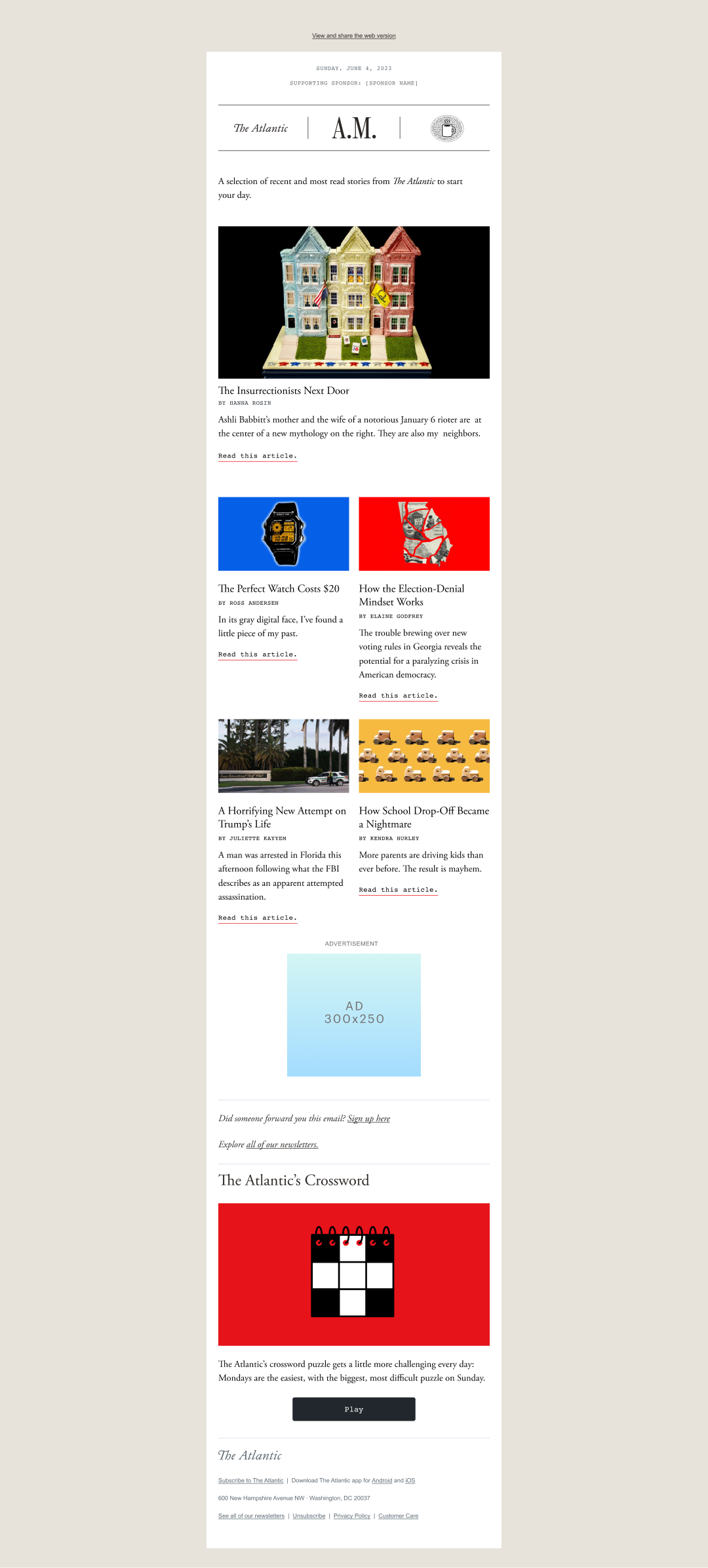
Soon after joining the Product Design team at The Atlantic, I have been the sole design owner of the newsletter ecosystem. I have continuously pushed the design of our newsletter to expand into other areas of our journalism, and developed a process that reduced engineering time for new newsletters to one week by improving design and CMS workflow. I have launched over 10 newsletters ranging from limited series newsletters covering the World Cup and AI, to The Atlantic A.M. which recirculates our most relevant stories and delivers them directly to readers every morning. Owning the design of The Atlantic’s newsletter experience has been such a joy. I love working within the limitations of inline HTML styling to create elegant designs that highlight our journalism.
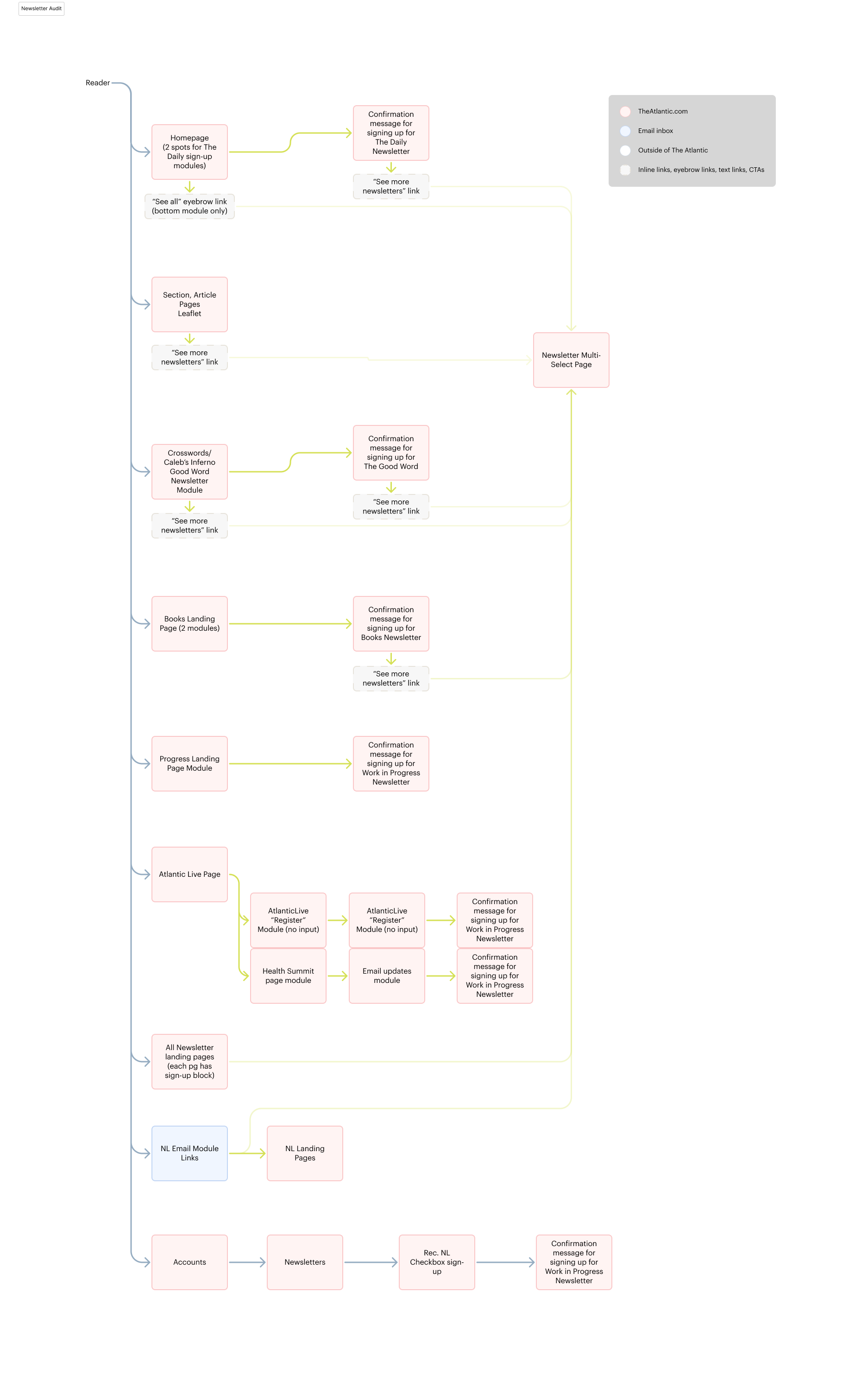
These multi-select sign up pages were created in collaboration with an associate level designer that I managed closely. We used visual elements from the newsletters to create a more clear user experience when browsing. Editors also took the suggestion to group newsletters into loose categories that help readers more easily find what fits their interests.
Role: Lead Product Designer
Live Site: The Atlantic Newsletters
Soon after joining the Product Design team at The Atlantic, I have been the sole design owner of the newsletter ecosystem. I have continuously pushed the design of our newsletter to expand into other areas of our journalism, and developed a process that reduced engineering time for new newsletters to one week by improving design and CMS workflow. I have launched over 10 newsletters ranging from limited series newsletters covering the World Cup and AI, to The Atlantic A.M. which recirculates our most relevant stories and delivers them directly to readers every morning. Owning the design of The Atlantic’s newsletter experience has been such a joy. I love working within the limitations of inline HTML styling to create elegant designs that highlight our journalism.
These multi-select sign up pages were created in collaboration with an associate level designer that I managed closely. We used visual elements from the newsletters to create a more clear user experience when browsing. Editors also took the suggestion to group newsletters into loose categories that help readers more easily find what fits their interests.
Role: Lead Product Designer
Live Site: The Atlantic Newsletters


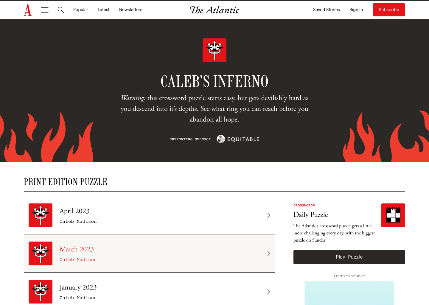
CROSSWORDS
Landing page
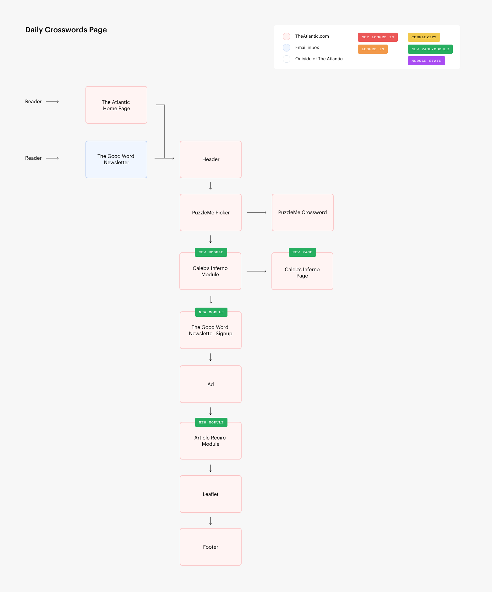
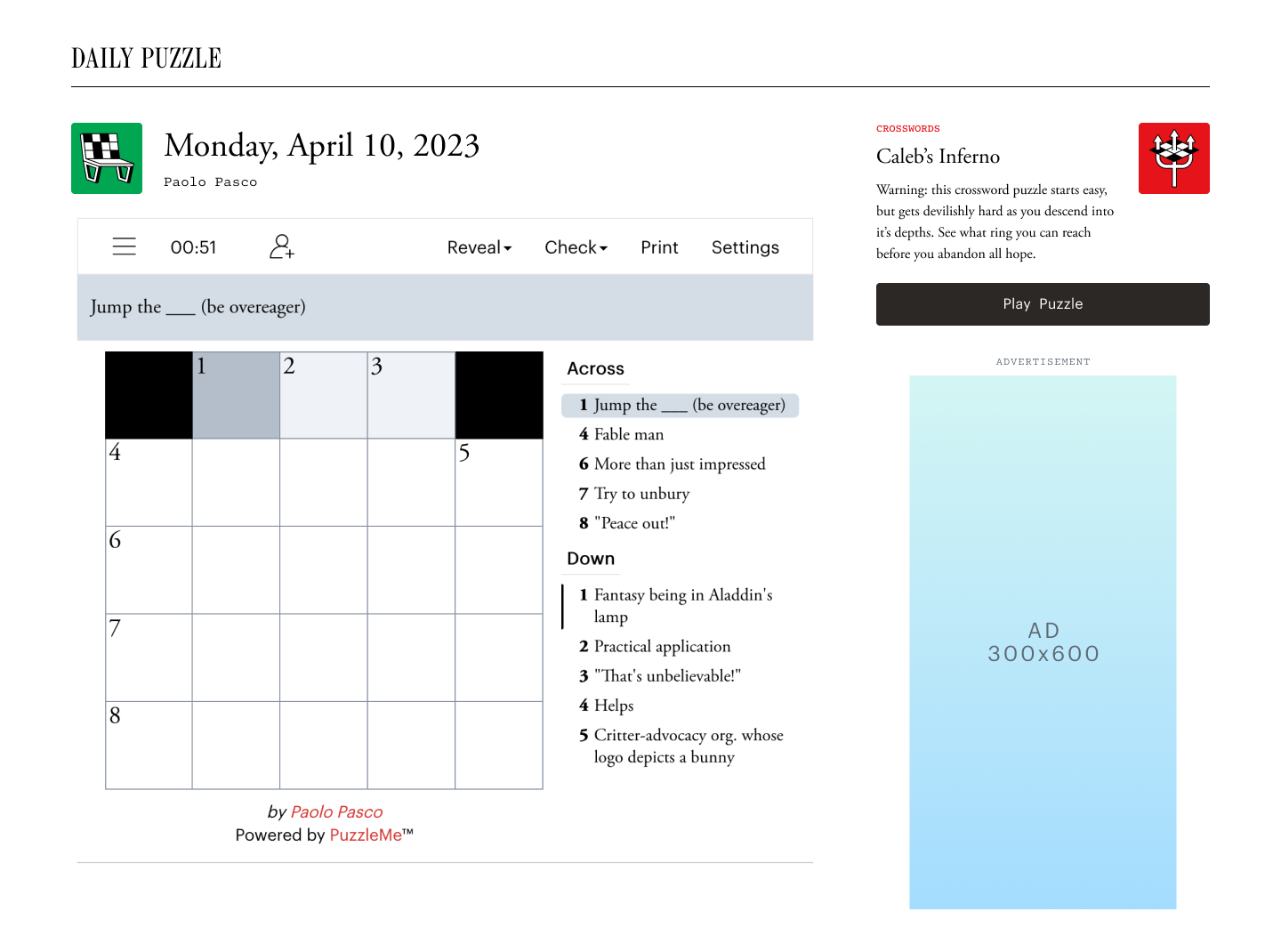
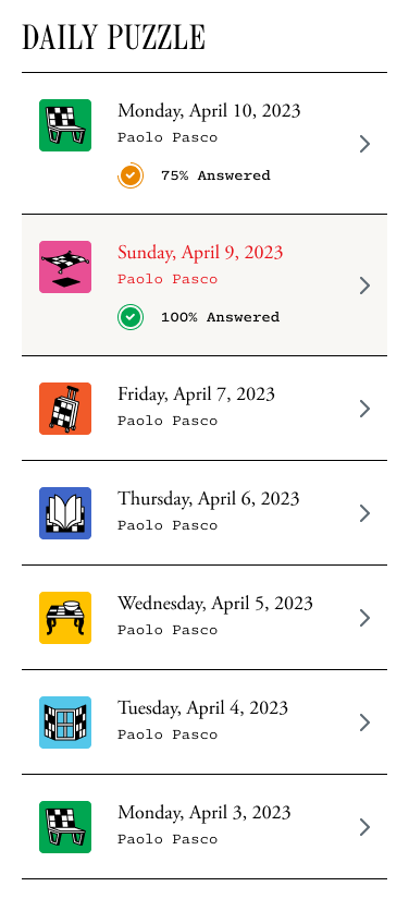
The Atlantic daily crossword is popular with many readers but had an outdated brand and layout. The new version of this crossword page highlights the great work our crosswords editors put in to keep things fun, fresh and moving in Crosswords. The page needed to be flexible to direct readers to new puzzle features such as Caleb’s Inferno: a devilishly difficult puzzle that gets harder as you move down its depths. This page utilizes our existing PuzzleMe platform with new custom icons and spacing to differentiate each daily puzzle and highlight the increasing difficulty throughout the week. An improved design layout for displaying ads, newsletter sign-up, and recirculation are other improvements we made to the page.
Role: Product Designer
Live Site: The Atlantic
Role: Product Designer
Live Site: The Atlantic


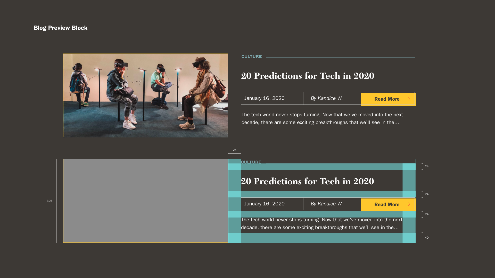
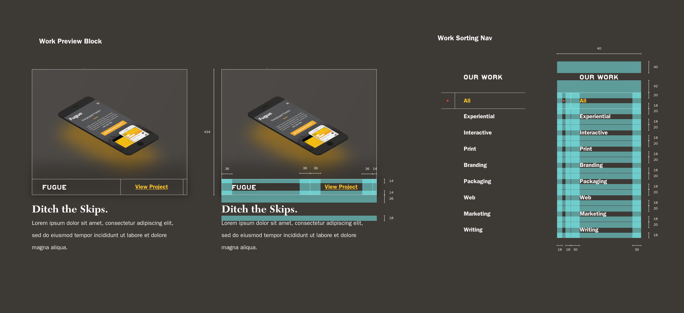
DUCKPIN DESIGN SYSTEM
Web
This design system explores a proposed redesign of the Duckpin website incorporating new branding and structure. The design system outlines spacing rules, new buttons, and components for everything from showcasing the work to reading the blog. The desire was to create a system that had some personality while still letting the client branding work shine through. This new system was also optimized to be more responsive and friendlier to the growing mobile traffic to the site.


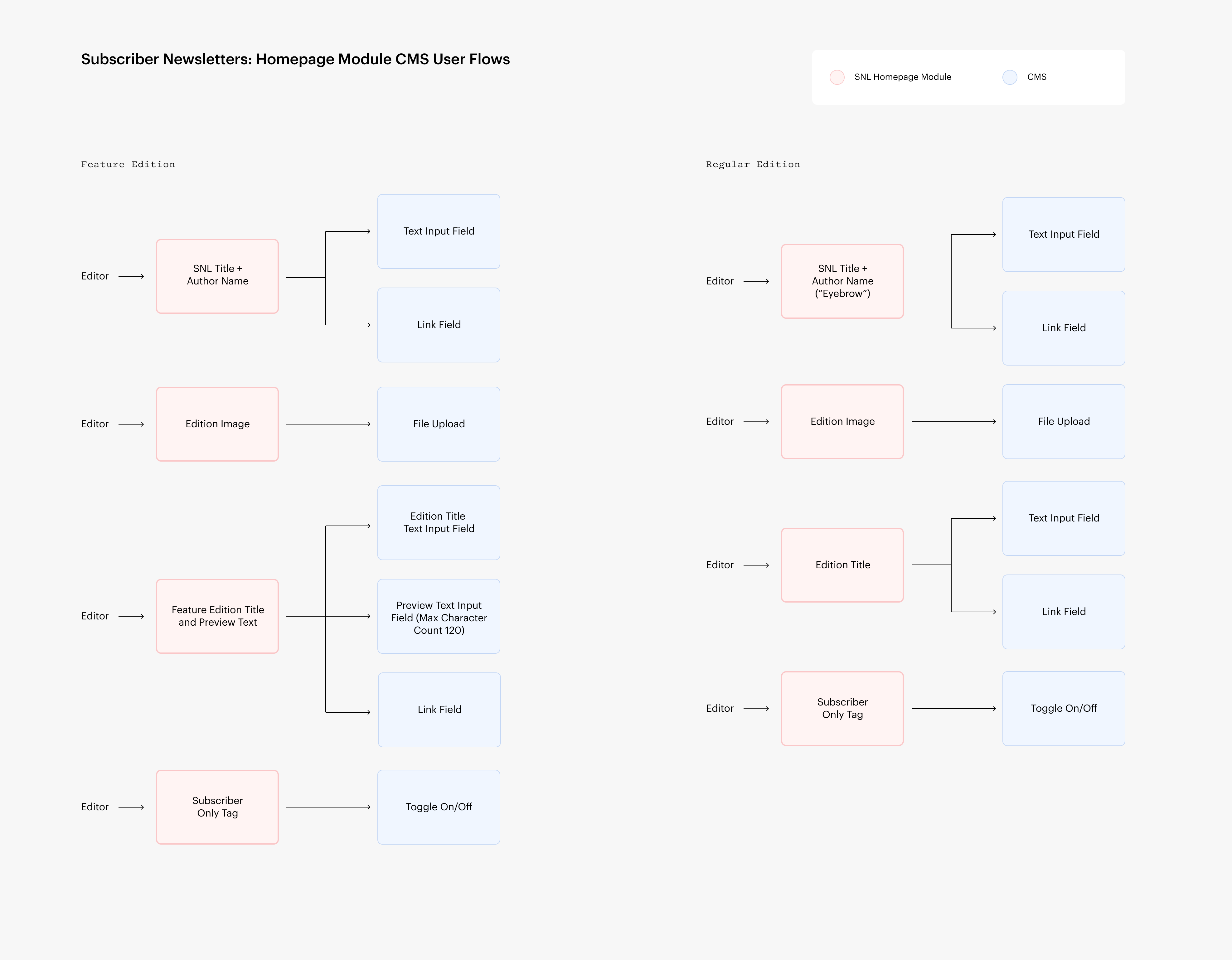
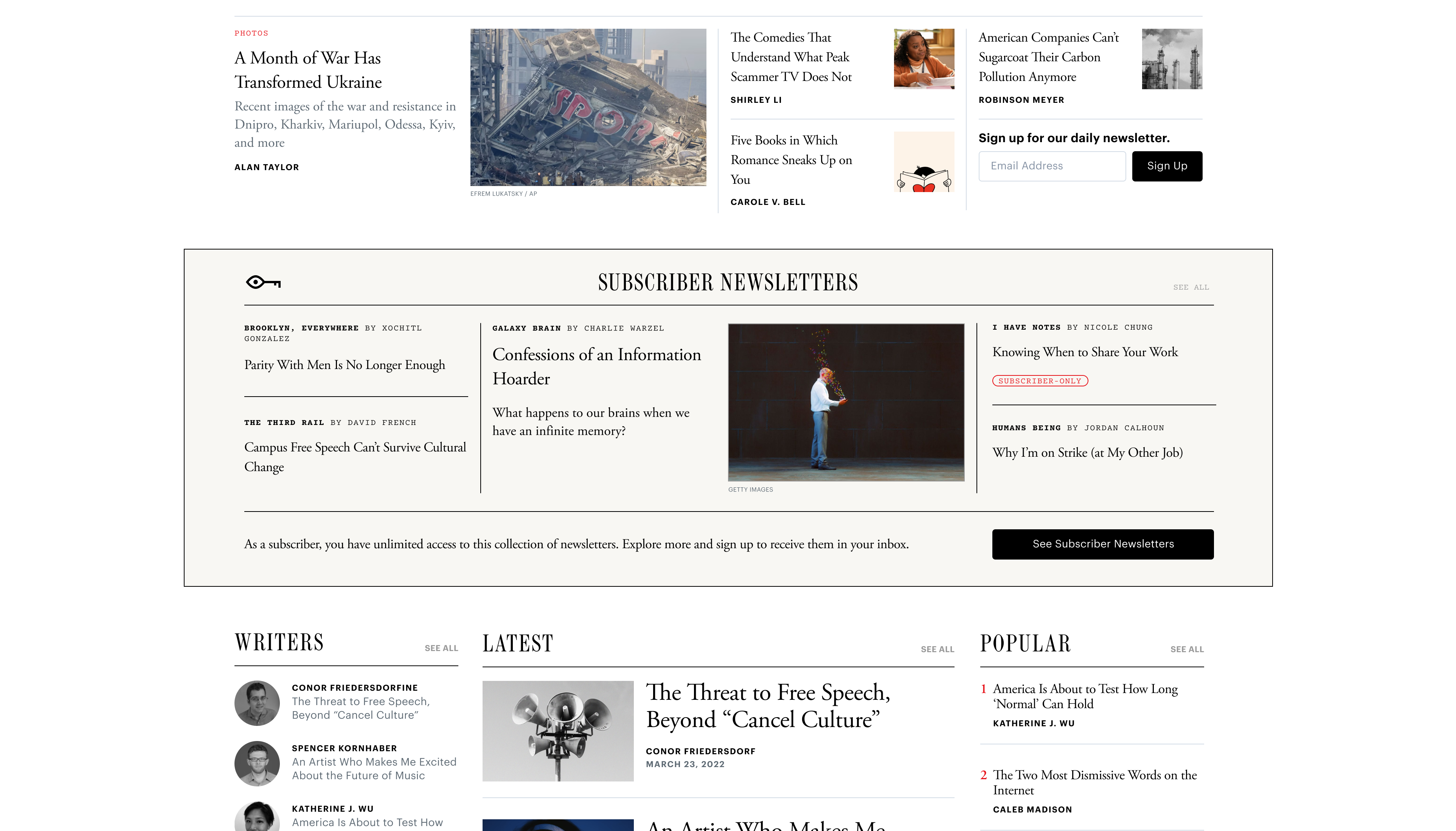
SUBSCRIBER NEWSLETTER
HOMEPAGE MODULE
Module Design
This module served as a way to circulate the now-retired subscriber-only newsletter suite offerings. This module drove clicks, impressions, and exposed readers to the Subscriber Newsletters branding. Surfacing a lead Newsletter in the center similar to our homepage treatment. The lead edition image drives more visual interest to the other editions in the module and competes with the stories on the front page of The Atlantic. Every item has labels to direct people to free and subscriber-only editions.